Fault Tolerance
Building modern web apps is a complex process with a lot of moving parts. Sometimes these moving parts come to a halt and things start breaking.

We do what we can to prevent this from happening, but the reality is that we'll never be entirely error-free. That means we should always expect that things will sometimes break in unexpected ways, and we need to be able to handle that gracefully.
In other words, we need fault tolerance:
Fault tolerance is the property that enables a system to continue operating properly in the event of the failure of some (one or more faults within) of its components.
In my experience fault tolerance is often overlooked and undervalued in web apps. We might have hundreds of tests that give us confidence that things probably won't break, but we don't take the same time to consider what happens when some inevitable failure happens. This is especially important if high availability is a priority (and it often is).
So how do we enable our React application to be fault tolerant?
Error Boundaries
The short answer is error boundaries. Currently the API is only available in class components and it looks something like:
componentDidCatch(error) {
  // When this gets called, you know an error has occurred!
  // Hurray for fault detection!

  // We can now do things like call setState to render a fallback
  // UI so that our users know an error has occurred.
  this.setState({ error, showFallback: true });
}
An error boundary in React is just a class component with the componentDidCatch method. If you want a nice starting point check out react-error-boundary.
The React docs do a great job of explaining what error boundaries are and how to use them, so I don't want to dwell on that. Go read the official docs first and come back if you want a good overview of the basics.
Drawing the Right Fault Lines
Adding an error boundary to your application is easy. It only takes a few lines of code. The tricky part is finding the right places to put them. As we'll see you usually want to follow the Goldilocks principle and implement "just the right amount" of error boundaries, but what is "just the right amount"?
First let's look at the two extremes so we can see what their downsides are.
Not Enough Error Boundaries
The first extreme: a single error boundary, right at the top of your application.
// ⚠️ I'll use react-error-boundary in these examples
import ErrorBoundary from "react-error-boundary";
import App from "./App.js";

ReactDOM.render(
  <ErrorBoundary>
    <App />
  </ErrorBoundary>,
  document.getElementById("root")
);
This is probably close to what most people do. It's essentially the same thing that happens when server-rendered applications fail. It's not a terrible experience either, it's just not the best we can do. The problem is that when one thing fails, everything else fails with it.
This approach would make sense if a failure in any part of your application meant that the entire thing was unusable. There are definitely some cases where this is true, but I don't think it's the common case.
Going back to the definition of fault tolerance:
Fault tolerance is the property that enables a system to continue operating properly in the event of the failure
We can see that a single error boundary doesn't really give us fault tolerance either since a single failure brings down the whole application.
Too Many Error Boundaries
Moving to the other extreme, you could try and wrap every component in an error boundary. The problems with this approach are more subtle so let's look at a more detailed example to see why this can be worse than a single error boundary.
Imagine we have this <CheckoutForm /> component that lets users see whats in their cart, enter their credit card info, and make their purchase.
function CheckoutForm(props) {
  return (
    <form>
      <CartDescription items={props.items} />
      <CreditCardInput />
      <CheckoutButton cartId={props.id} />
    </form>
  );
}
Now lets wrap every component here in an error boundary
// Everyone gets an error boundary!
<form>
  <ErrorBoundary>
    <CartDescription items={props.items} />
  </ErrorBoundary>
  <ErrorBoundary>
    <CreditCardInput />
  </ErrorBoundary>
  <ErrorBoundary>
    <CheckoutButton cartId={props.id} />
  </ErrorBoundary>
</form>
In a real world example of this, each component would probably wrap its own export in an error boundary (like with react-error-boundary's withErrorBoundary higher-order-component) instead of inlining them like this. Just ignore that part 🙂
At first blush this might seem like a fine idea; the more granular your error boundaries are the less impact a single failure has on the application as a whole. That sounds like fault tolerance! The problem with this is that minimizing the effect of an error isn't the same as being fault tolerant.
Pretend something in the CreditCardInput component broke.
<form>
  <ErrorBoundary>
    <CartDescription items={props.items} />
  </ErrorBoundary>
  <ErrorBoundary>
    {/* Uh oh! Something broke in here 😢 */}
    <CreditCardInput />
  </ErrorBoundary>
  <ErrorBoundary>
    <CheckoutButton cartId={props.id} />
  </ErrorBoundary>
</form>
If we break down what this would mean for the user experience (UX) we can see that this might put our users in a world of hurt.
Half-Broken UI is Full-Broken UX
Since CreditCardInput has its own error boundary the error won't propagate to the rest of the CheckoutForm component, but the CheckoutForm component isn't usable without CreditCardInput 🤔. The CheckoutButton and CardDescription components are still mounted so the user can still see the items and attempt to checkout, but what if they didn't finish entering their credit card info? If they did enter the credit card before CreditCardInput crashed was that state retained? What happens when they try to checkout?
I'm betting even the author of these components wouldn't know what would happen in this case--let alone the user. This is likely to be confusing and frustrating for them.
Generic Error Boundary, Generic Fallback
The degree to which this is frustrating and confusing also depends on what you render as your fallback. Does the component just pop off the screen without warning? That would be really confusing to almost everyone.
If not, you're probably using a shared fallback UI. Maybe it renders a sad face with some helpful information about the error. This is better than nothing, but if you're wrapping every component in this error boundary it means this fallback has to render correctly for every possible UI element. This is near impossible to do right, since different elements have different layout requirements. A fallback that is good for a page-level section like a header is bad for a small icon button, and vice-versa.
Hopefully the problem(s) are apparent: wrapping every component in an error boundary can lead to a confusing and broken user experience. It often puts your application into an inconsistent state that can frustrate and confuse users. It's interesting to note that avoiding "corrupted state" is actually one of the main reasons that error boundaries even exist in the first place:
We debated this decision, but in our experience it is worse to leave corrupted UI in place than to completely remove it
Performance Penalty
Error boundaries also come with some inherent overhead, so overusing them can negatively affect performance. This should only be a problem if you use them everywhere, so don't let this scare you away from using them all together.
The Right Amount of Error Boundaries
So, to recap: not enough error boundaries means errors take down more of the application than necessary, and too many error boundaries can lead to corrupted UI state. So what is the right amount of error boundaries?
There's no single number that we can point to and say "that is the right amount" because it depends on your application. The best approach I found is to identify the feature boundaries in your application and put your error boundaries there.
Finding Features
There is no universal definition of a "feature" that we can use to look at arbitrary apps and identify their boundaries. I know it when I see it is usually the best we can do, but there are some common patterns that you can use as guidelines.
Most applications are made up of individual sections that get composed together. A header, navigation, main content, sidebars, footers, etc. Each of them contribute to the user experience as a whole, but they retain a certain level of independence.
Let's look at Twitter as an example:
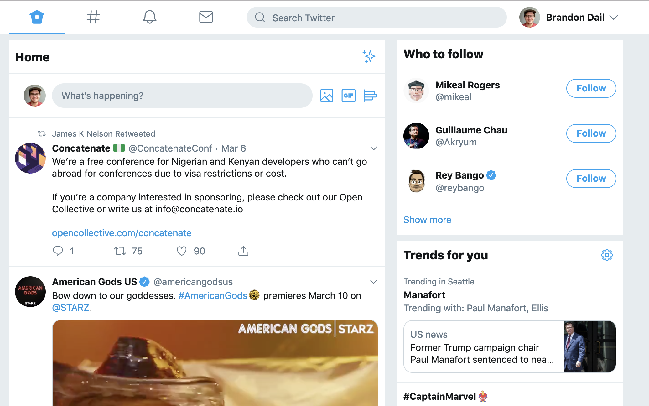
It's immediately clear that there are distinct sections and features on the page. The main timeline for tweets, the follower recommendations, the trends section, and the navigation bar. The layout and styling of these sections even indicate there's a division between the sections which is a really good starting point: sections that are visually independent are likely independent features which are exactly where you want your error boundaries.
If a component in one of these sections throws it seems fair to say that the other sections shouldn't also crash. For example, if the follow button in the follower recommendations section crashes it shouldn't also take down the main timeline.
A Recursive Line of Questioning
UIs are often recursive. At the page-level you have these big sections like sidebars and timelines, but then inside those sections you also have sub-sections like headers and lists, which contain other sections, and so on.
When identifying the right place for error boundaries a good question to ask yourself is "how should an error in this component affect its siblings?". In the <CheckoutForm /> example this is exactly the question we considered: if CreditCardInput failed, how should that affect CheckoutButton and CardDescription?
By recursively applying this line of questioning to your component tree you can quickly identify where your feature boundaries are and put error boundaries around them.
Twitter Deep Dive: The Page
Let's use Twitter as an example again, to see how this would work. We'll start at the top and then drill down into the follower recommendation section.
This analysis contains no small part opinion and bias based on my perception of these features work and how I'd expect them to work. It's not meant to be the "correct" answer, we just want to get a feel for the process itself.
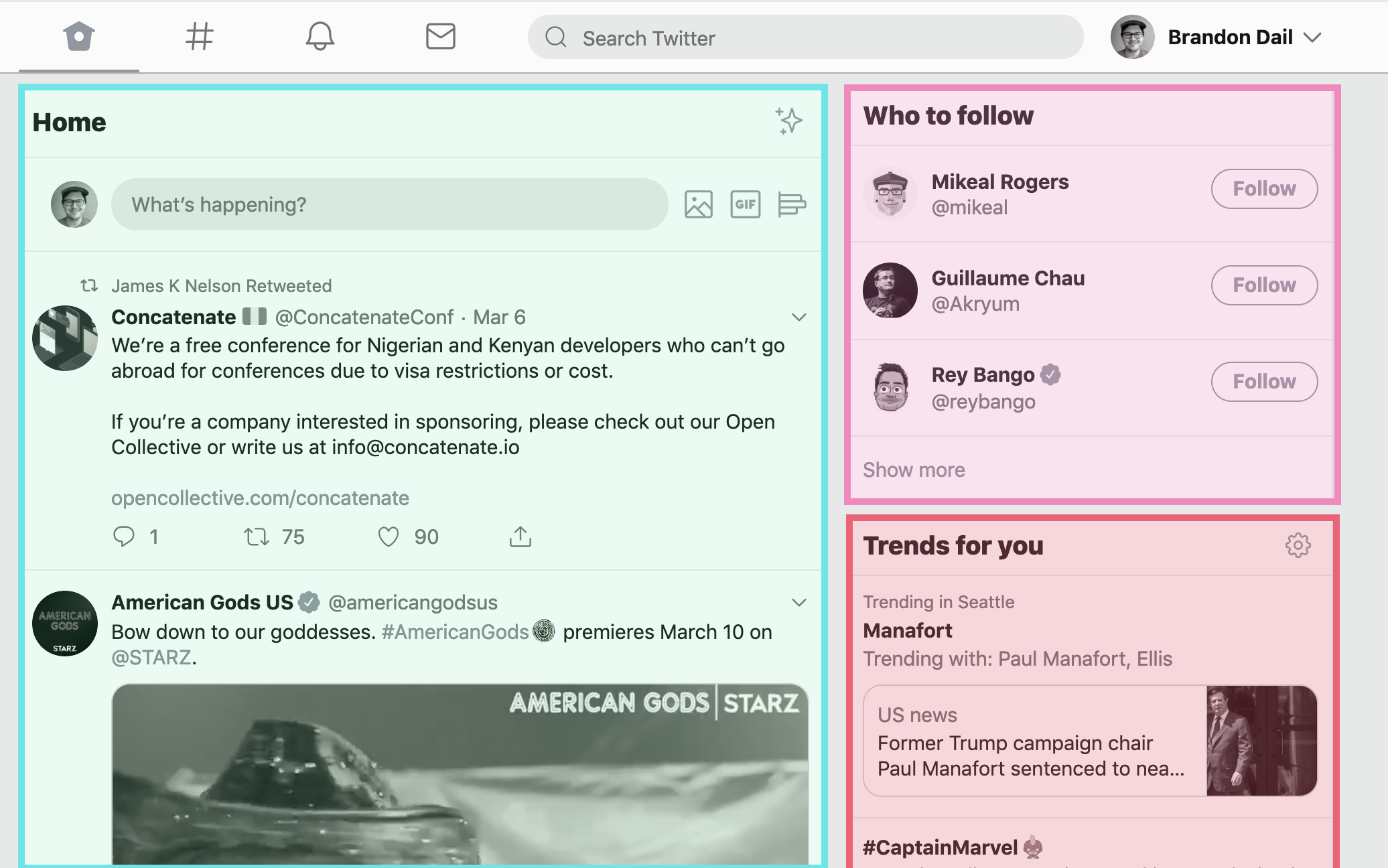
Starting at the top we can identify three main content sections: Home, Trends for you, and Who to follow. Let's drill into the Who to follow section.
We start by asking ourselves:
How should an error in this component affect its siblings?
We can make this question a little more concrete by rephrasing it as:
If this component was to crash, should it's siblings also crash?
So when considering Who to follow we ask: if the Who to Follow section crashed, should the Home and Trends sections also crash?. I think this is a clear case where they shouldn't. The other sections don't seem to rely on each other, so this is a great place to put an error boundary.
Twitter Deep Dive: Who To Follow
Now we apply this same line of questioning to the Who to Follow section as well.
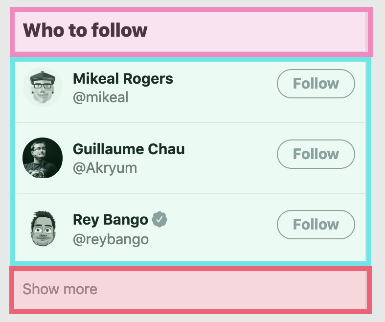
With the focus on Who to Follow we see three obvious sections: The title, the list of users to follow, and the show more button. Drilling into the list of users we again ask ourselves the same question: if the list of followers was to crash, should the title and "show more" button also crash?. In this case it's a little less obvious but I think they probably shouldn't. Keeping the title around doesn't really hurt anything and the "Show more" button links to another page which itself might be working. So the answer again yes, let's add another error boundary!
Twitter Deep Dive: Follower Recommendation
Let's do it one more time, looking at of the follower recommendations:

There are only two sections here so we can just ask: if the user's name and handle were to crash, should the Follow button also crash and vice-versa?
In this case I feel like the answer is yes! If the user's name and handle were gone, we wouldn't know who we were following. If the Follow button was gone it could be frustrating to get a recommendation without any sort of action.
Testing your Fault Tolerance
Now that we know a little more about using error boundaries and fault tolerance, I want to share one of my favorite parts about this whole thing: how you can testing this all out. The best, low-effort way I've found to test your application's fault tolerance is to just go in and manually break things.
function CreditCardInput(props) {
  // What happens if I messed up here? Let's find out!
  throw new Error("oops, I made a mistake!");
  return <input className="credit-card" />;
}
This is something that I've started doing with every new component I add and it's been really helpful to see how our applications handle failure. Just make sure you don't commit any of those throw statements 🙂
Aside: Chaos Engineering
Intentionally throwing errors to test fault tolerance is a very mild example of chaos engineering. I'd love to see more utilities in the React community around this concept.
What if we had something like React.ChaosMode that let you test fault tolerance by randomly breaking some component(s)?
Summary
So this is all mostly a long winded way of saying you should:
-
Avoid having just a single error boundary at the top. It's rare that this is the best way to handle failures.
-
Don't overuse error boundaries either. It leads to a poor user experience and can potentially hurt performance.
-
Identify the feature boundaries in your app and put your error boundaries there. Since React apps are structured as trees, a good approach is to start at the top and work your way down.
-
Recursively ask yourself "if this component crashes, should its siblings also crash?". It's a good heuristic for finding those feature boundaries.
-
Intentionally design your app for error states. When you put error boundaries at feature boundaries it's much easier to create custom fallback UIs that look good and let the user know that something has gone wrong. You could even implement feature-specific retry logic so that users can refresh that section without refreshing the whole page.
-
Go break things on purpose to see what happens.